MoMA librarian Jennifer Tobias takes a recent trip to the Paper Conservation Lab as a jumping off point to explore the ins and outs of mechanical reproduction in the 1920s. Specifically, she takes a close look at a series of images in a set of avant-garde Czech magazines, to explore questions around how photographs were shared for publication across the country, and abroad.
“Reproductions . . . more than originals, mediate the artistic-cultural relations of today,” declared Czech avant-garde catalyst Karel Teige in 1922, joining other experimental artists, writers, editors, and designers exploring the expressive possibilities of new photographic and printing technologies.1Karel Teige and Jaroslav Seifert, “Umění dnes a zítra,” in Revoluční sborník Devětsil (Prague: Vecernice, 1922), 187–202; quoted in Peter Zusi, “Vanishing Points: Walter Benjamin and Karel Teige on the Liquidations of Aura,” Modern Language Review 108, no. 2 (April 2013): 368–95, https://www.jstor.org/stable/10.5699/modelangrevi.
Teige and fellow members of the 1920s leftist avant-garde group Devětsil put these ideas to the test in the production of experimental journals such as Disk (two issues published, 1923 and 1925), Pásmo (Zone; 1924–26), and ReD (Revue Devětsilu; 1927–31). “Little magazines” such as these thrived in Europe during this period, integral to an international network in which members of the avant-garde could share ideas.2Peter Brooker and Andrew Thacker, eds., Oxford Critical and Cultural History of Modernist Magazines (Oxford: Oxford University Press, 2009).
But what was involved in bringing these abstract ideas about mechanized life to the messy reality of print publishing? What can be learned from the close examination of Czech journals in particular?
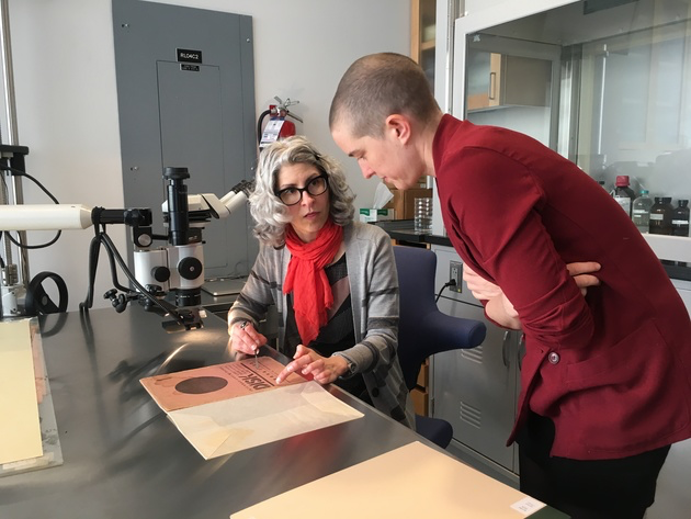
To find out, I joined an impromptu team of researchers at the MoMA Paper Conservation Lab. There, Meghan Forbes (C-MAP Fellow for Central and Eastern Europe), Barbora Bartunkova (Museum Research Consortium Fellow), and I (Reader Services Librarian) sat with Erika Mosier (Associate Conservator) and Lee Ann Daffner (Andrew W. Mellon Foundation Conservator of Photographs) to share our varied expertise. Laura Neufeld (Assistant Paper Conservator) got into the act later, capturing the magnified images shown here.
Gathering around the microscope, we examined several journals in the MoMA Library collection, seeking evidence of how group members manifested their ideas about the power of reproduction through actual photomechanical reproduction. We wondered, how did image processing work then? Were the methods they used similar to those employed in European printing centers such as Paris and Berlin, or were there local differences? What kinds of production choices did the group make, and what creative strategies emerged in the process?
Our adventure began with the word štočky. Translated variously from Czech as cliché, copy negative, or copy print, and pronounced to an American ear like “SHTOTCH-kee,” these photo-based images appear to have been key elements in the printing process and crucial to the exchange of visual ideas among publishers. But what are they exactly? How did they function in the printing process? And why were they passed around so much by editors?
These questions emerge from Meghan’s dissertation, “In the Middle of It All: Prague, Brno, and the Avant-Garde Networks of Interwar Europe,”3Meghan Forbes, “In the Middle of It All: Prague, Brno, and the Avant-Garde Networks of Interwar Europe” (PhD diss., University of Michigan, 2016), https://deepblue.lib.umich.edu/handle/2027.42/1333 through her primary source references to the exchange of štočky. For example, in a 1930 letter in German, Neue Stadt and Neue Frankfurt editor Josef Gantner urged Teige, “Please send me immediately the cliché of the Prague housing estate [Baba, the Czech Werkbund modernist housing development].”4Josef Gantner to Karel Teige, 18 November 1930, PNP, KT Archive; quoted in Forbes, “In the Middle of It All,” 232n471; and in Meghan Forbes, “‘To Reach Over the Border’: An International Conversation between the Bauhaus and Devětsil,” in Umění/Art: Journal of the Institute of Art History in Prague 64, nos. 3–4 (December 2016): 292. We would learn from other examples that the term cliché was used interchangeably with štočky in German and French correspondence of the time.5Adrian Sudhalter, personal communication with author, March 2019.
As a catalyst for avant-garde publishing, Teige was a good source for such material, based upon “the method of interchange he set up at an early stage through [the journal] Stavba. The regular accounts of current developments that Teige published in the magazine depended on a network of contacts, constantly maintained by correspondence and the exchange of documents.”6Karel Teige, Modern Architecture in Czechoslovakia and Other Writings (Los Angeles: Getty Research Institute, 2001), 15. He also had štočky on hand from the production of Pásmo and Disk, even sending a list (for return) to Devětsil colleague Artuš Černík in Brno.7Karel Teige to Artuš Černík, October 1924, PNP, AČ Archive; quoted in Forbes, “In the Middle of It All,” 228–29n466. I discuss one of these images, a work by Ludwig Mies van der Rohe, below.
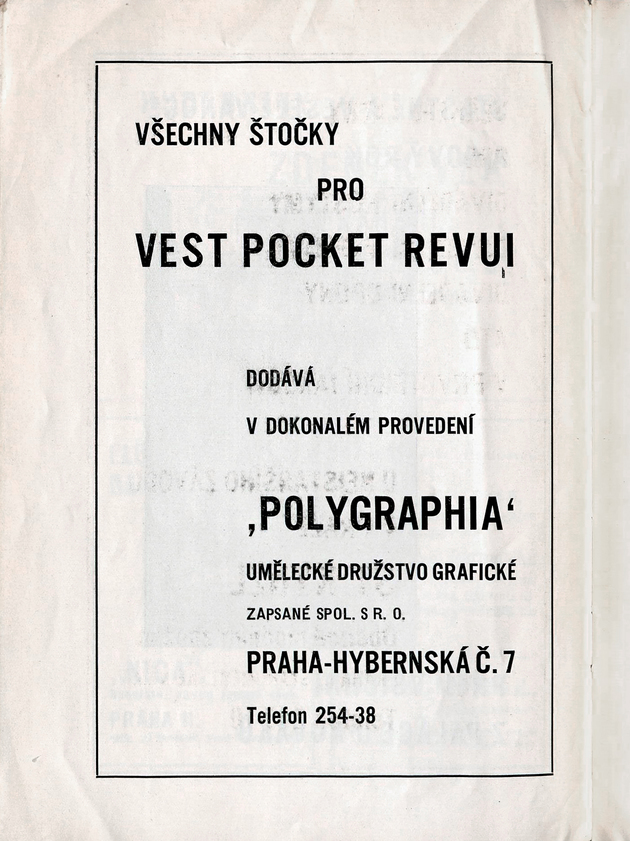
Expanding upon this research using the MoMA Library collection, Meghan spotted an advertisement for štočky in another Czech journal from this period: “All štočky for Vest Pocket Revue are supplied by [the graphic arts association] Polygrafia in perfect condition.”8Vest Pocket Revue, no. 3 (1929–30), unpaginated advertisements between cover and the first page. Another full-page ad in the journal ReD touts, “Why throw money out the window on expensive štočky when you can obtain them at a lower price and better made from B. Peješ and Company?”9ReD 2, no. 1 (1928): 39.

From this evidence, then, we knew that štočky are images in some physical form that could be readily circulated and printed. But we wanted to learn more.
Back in Paper Conservation, we examined issues of the 1920s Czech journals Disk, ReD, Pásmo, Vest Pocket Revue, and the book Film10Karel Teige, Film (Praha: Nakl. V. Petra, 1925). from the MoMA Library collection. Our search for štočky focused here on images in Pásmo, nos. 9 (1924) and 10 (1925), specifically the masthead, a “photographic poem” by Jiří Jelínek, and a reproduction of Mies van der Rohe’s Friedrichstrasse skyscraper project.
To understand what we were looking at, we needed to review printing processes of the time, specifically letterpress production, and to distinguish the mechanics of printing solid areas (such as lines and shapes) and tones (photographs in particular). At this point, Lee Ann looked up from the gelatin silver prints on her examination table. Standard commercial printing at the time, she explained, involved arranging metal type and images (the latter processed into typelike blocks) in a metal frame, or chase. Once set up in the printer, the composition was repeatedly inked and pressed into paper.
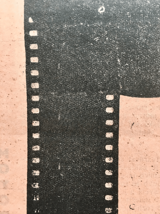
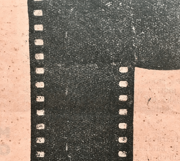
Štočky, it turns out, played a key role early in this process of transforming images into small metal printing blocks (here called line blocks and halftones). They and their brethren clichés, copy negatives, and copy prints could take a variety of forms: they could be negative or positive photographic images developed on glass, paper, or film; they could also be either screened (I’ll get to that) or unscreened. One thing they had in common, however, was though they were expensive to produce, they could be sent through international mail, which enabled them to be circulated among publishers.
Crucially, štočky (I’ll call them “process images” from here) served as a key reproductive step in the process of turning an origin image, such as a line drawing or photograph, into print form. Moreover, the images they were based on were generally made with print publication in mind. In fact, the term camera ready then referred to an origin image that would hold up well during transformation into a process image, then printing block, then composition (known as a “forme”), and then print.

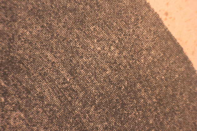
To make this first reproduction, images entirely composed of black and white (known as line art) were photographed one way, and continuous tone images (such as photographs) were photographed in a slightly different way. Both were photographed in high contrast to make a printer-friendly image, but continuous tone images were shot through a screen, filtering the tones into black dots of varying size. In this way, all elements of a composition (type and images) were rendered in pure black and white, ready for etching into blocks. From here we’ll call these “line blocks” (for black-and-white images) and “halftones” (for tonal images such as photographs).
Lee Ann pointed us to an example of a line block from the time, discussed by Adrian Sudhalter (Distinguished Scholar, Lauder Research Center for Modern Art at The Metropolitan Museum of Art) during her reconstruction of Tristan Tzara’s unrealized publication Dadaglobe.11Adrian Sudhalter, ed., Dadaglobe Reconstructed(Zürich: Scheidegger and Spiess, 2016). To make this block for the related publication Dadaco,12Ibid., 93–94. an image of a certificate was photographed in high contrast and then etched into zinc. The zinc plate was then attached to a wood block, making it interchangeable with type and other print elements.
While this process may appear to be fully mechanized, for most of its history, photomechanical reproduction was a complex, labor-intensive craft involving optics, chemistry, metalworking, woodworking, and other technical skills. Printing meant working with materials such as acid and cyanide, hammers and chisels—and even a substance known as “dragon’s blood.”13For an extremely detailed contemporary description of the halftone process and printing block production, see Julius Verfasser, The Half-Tone Process: A Practical Manual of Photo-Engraving in Half-Tone on Zinc and Copper(Bradford: Percy Lund, 1895), https://archive.org/details/halftoneprocessp00verf_0/page/1. A fifth edition was published in 1912.
“Plastic anvil” is theoretician Reyner Banham’s way of describing how industrial production (such as letterpress printing) depended upon such technicians “performing a function relying heavily on coordination of hand and eye, knowledge of material, and accumulated years of what can only be called craft skill.”14Reyner Banham, “Sparks from a Plastic Anvil,” in Journal of Modern Craft 1, no. 1 (March 2008): 137–46. This text is a transcription of a lecture given at the Victoria and Albert Museum, London, on April 12, 1973. The quote appears on page 138. Machine precision, he argued, was a myth “propagated by twentieth-century aesthetes,” in particular “the high poetry of Le Corbusier and the Futurists in the 1920s.”15Ibid., 140.
Banham made a further point relevant to process images: traditional manufacturing depends upon limited precision, which was “not that aspect of machinery that was so much admired in the 1920s and 1930s.”16Ibid. Specifically, the interchangeable part so fundamental to industrial production “can only be made to interchange by making the fit sufficiently sloppy.”17Ibid. This built-in imprecision, or tolerance, he argued, enables parts to work together just right. If we think of process images as an interchangeable part of avant-garde exchange, we can see that they fit this criterion well. These idea-parts were easily transportable and also malleable enough to work together through the mail and the production process.
Looking for these process images—and plastic anvils—back in the lab, we next focused the microscope on line block and halftone images in Pásmo.
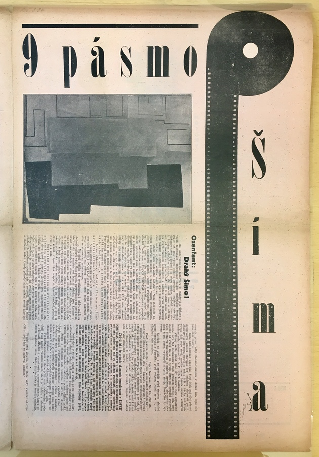
We started with the bold masthead of early issues such as Pásmo 1, no. 9 (1924). Commanding the right column, a strong graphic forms a sans serif P from a strip of film and, apparently, a circle, with the journal title in a serif typeface beside it.
In her dissertation, Meghan notes that pásmo translates as zone, but also as band or belt.18Forbes, “In the Middle of it All,” 233–24. This linear quality makes for a compelling image in itself, but also anticipates intense interest in typographic experimentation. Much of this was focused on reforming traditional typography in line with modernist principles of functionalism and mechanization. Like the Pásmo P, these experiments often involved reduction to geometric elements (circles, lines) and elimination of traditional attributes (e.g., capitalization, serifs, variable strokes, and italics).
The best-known example is Herbert Bayer’s 1927 Universal alphabet.19Ellen Lupton, “Herbert Bayer: Designs for ‘Universal’ Lettering, 1925 and 1927,” in Bauhaus: Workshops for Modernity (New York: MoMA, 2009), 200–205. A metal typeface was never produced, and a digital font was created only in the mid-1990s. Bayer’s experimental lettering system would become known to Devětsil group members through the journal ReD, in which a rendering of it was reproduced in 1929—and critically evaluated by Teige himself.20ReD 2, no. 8 (1929): 257. Also in 1927, Kurt Schwitters introduced Systemschrift, a reform alphabet based on phonetic principles.21Kurt Schwitters, “Anregungen zur Erlangung einer Systemschrift,” in i10 1, nos. 8–9 (August/September 1927): 312–16. See also Hannah Pröbsting, “Everyday Printed Matter: Kurt Schwitters’ Experimental Typography,” in International Perspectives on Publishing Platforms: Image, Object, Text, ed. Meghan Forbes (London: Routledge, 2019), 200–23. Preceding all of these is the logo for Max Burchartz’s design firm Werbebau, which features a lowercase b. Moreover, similar P’s and a lowercase b are reproduced in Jan Tschichold’s influential Die neue Typographie.22Forbes. “In the Middle of it All,” 237n477. Jan Tschichold, Die neue Typographie: ein Handbuch für zeitgemäss Schaffende (Berlin: Verlag des Bildungsverbandes der deutschen Buchdrucker, 1928).
At first glance, the P appears to be solid black. One assumes that the circle is a flat shape, with an overexposed filmstrip added to render the letter. But Meghan noticed some tonal variation in the circle, suggesting an image of a vinyl record (or possibly a reel of film), and indeed, one can make out a pattern suggesting just that when looking at it through a microscope. Looking even more closely, a series of tiny white flecks within a faint outline of frames hinted that an actual film clip could have been used as the stem of the P.
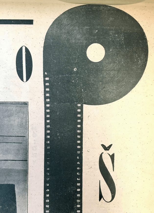
If the P was intended to be a strictly black-and-white element, it would have been prepared and processed that way. In other words, a big black circle, probably hand drawn, would have been overlaid with an overexposed strip of film. This would then have been photographed in high contrast (i.e., made into a process image), on its way to becoming a line block.
But if the P was intended to read as a photomontage of an LP and a film clip, it would have been photographed and processed as a halftone. In this scenario, an image of an LP and a strip of film would have been pasted together and then rephotographed through a halftone screen. Under the microscope, halftone dots are clearly visible on both the LP and the film strip, strongly suggesting that the creators intended it to be read as a photomontage and not as a simple graphic.
The next Pásmo image we placed under the microscope prompted similar questions about photomontage and publisher intention. This time we looked at an example of Devětsil’s signature photographic poems or picture-poems, of particular interest to Barbora.

Turning to page 6, we found “Remo Fotografická báseň” (Photographic poem by Remo [Jiří Jelínek]). Combining image and type for expressive purposes, picture poems were conceived by Devětsil’s offshoot Poetist group as a thoroughly modern expressive form, merging the “economy, truth, [and] brevity” of telegrams and photographs.23Jindřich Štyrský, “Picture” (Obraz), in Disk, no. 1 (1923): 1; translated in Timothy O. Benson and Éva Forgács, eds., Between Worlds: A Sourcebook of Central European Avant-Gardes, 1910–1930 (Cambridge: MIT, 2002), 364. See also Irina Denischenko, “Photopoetry: Czech Poetism and the Photographic Image,” in Beyond Given Knowledge: Investigation, Quest and Exploration in Modernism and the Avant-Garde, European Avant-Garde and Modernism Studies 5 (Berlin: De Gruyter, 2017), 95–113.
Poetism grew from Devětsil interest in mass-produced imagery. The modern picture, Teige argued, should be “either a poster—that is, public art, like the cinema, sports, and tourism, with its place in the street—or a poem, pure visual poetry, without literature, with its place in the book, a book of reproductions, like a book of poems.”24Karel Teige, “Painting and Poetry” (Malířství a poezie), in Disk, no. 1 (1923): 19–20; translated in Benson and Forgács, Between Worlds, 367–69. He was confident that “picture poems conform precisely to contemporary requirements. Mechanical reproduction provides the means for making picture books. Books of picture poems will need to be published. Methods of mechanical reproduction will assure the wide popularization of art.”25Ibid., 368.
The Pásmo image clearly aspires to this ideal. Montaged elements include musical notation, photographs depicting ships and wildlife, and words, such as the English phrase “NEVER MORE” hand lettered in the middle. Some of these are joined and some are set into heavy black or white borders. A white L-shaped border holds the components together, with the date 1924 and the inset “MANON” suggesting a title or label, possibly referencing an eighteenth-century comic opera by Jules Massenet or another musical reference (Jelínek was an accomplished jazz trumpeter).
Here the production photographer was presented with a single image composed of both line art and continuous tones. Processing it as a line block would have reduced the photographs to high contrast black-and-white shapes. Processing it as a halftone would have tended to yield fuzzy, low-contrast line art. The photographer chose the latter, as the murky result shows.
What’s lost in the murk are the choices made by (perhaps) the artist and (definitely) by the production team to yield the best result. For example, the photographer could optimize exposure, the developer could burn and dodge, the platemaker could do some precise chiseling, and finally the printer could optimize ink flow to achieve the most legible outcome.
What’s unclear is how much the artist understood this process and whether he took it into account in making the work. If reproduction was truly the future of art, as Devětsil proposed,26See Denischenko. did Remo consider camera readiness when making the origin image? Consider the musical notation, for example. Was it a piece of found material, cut and pasted into the composition, or was it rendered specifically for it? Incorporating found material might have been a purposeful choice, celebrating the readymade element of collage at the expense of print legibility. But if the notation was rendered specifically for the purpose of reproduction, then the artist had to make choices about scale, line weight, and contrast, which would have influenced how the work communicated in print.
Production considerations also figure into the layers of borders within and beyond the origin image. The work plays with this dark and light framing, with further complexity added by photographs butted together and partially layered. One possible production effect is found in the heavy dark border edging the origin image: its varying thickness (thinner on the sides, thicker on the top) suggests that the work’s proportions were modified to fit the print layout.
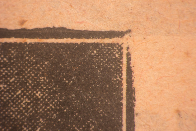
Then there’s the thin outer border around the whole image, shown here magnified. Edging images—either by chiseling into the block or by adding lead rules around it—was standard procedure at the time, and the practice is found throughout the issue. It served as a way to delineate images, especially those with large unprinted areas, as seen in the final image we examined. But in the picture-poem, the edging blurs the border (so to speak) between the origin work and the print layout. Was Remo aware of these factors when preparing the work, and if he was, would it have influenced how he made the origin image?
A close look at the initial collage, if extant, might provide evidence (or its absence) of preparing the work for camera readiness. Despite the group’s preference for reproductions, some maquettes survive,27See Eric Dluhosch and Rostislav Švácha, eds., Karel Teige, 1900–1951: L’Enfant Terrible of the Czech Modernist Avant-Garde (Boston: MIT, 1999); Karel Srp., Karel Teige a typografie: asymetrická harmonie (Prague: Akropolis, 2009); and Rea Michalová, Karel Teige: Captain of the Avant-Garde (Prague: Kant, 2018). and perhaps these works will have their day under the microscope, too.
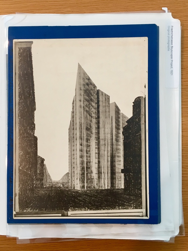
Finally, we looked at Pásmo 1, no. 10 (1924), zooming in on an image of Mies van der Rohe’s Friedrichstrasse skyscraper project (1921),28Documented by several works in the MoMA collection. one of several versions of this influential perspective view.29The most recent example is Adrian Sudhalter, “Friedrichstrasse: The Contexts of an Image, 1922–1924,” in Mies van der Rohe: Montage = Collage (London: Koenig, 2017), 68–85.
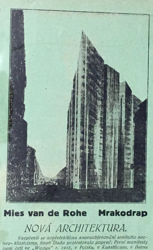
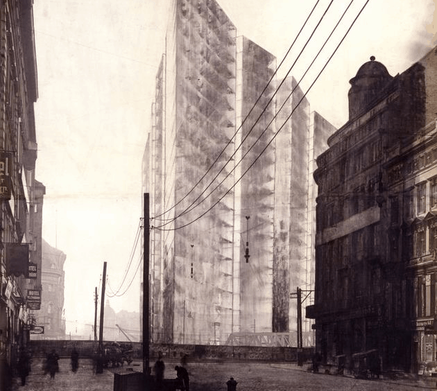
Pásmo reproduced the now-historic large-scale perspective drawing only a few years after Mies put charcoal to tracing paper and arranged for publication of the results in several German journals. It’s unclear how the Pásmo editors sourced the image, but they either received a scaled-down process photograph in the mail from an international contact or made one from an available reproduction. From there, the image was clearly processed as a halftone and paired with commentary.
The image is striking for its forceful composition, in which a stark tower dominates a Berlin street relegated to the shadowy edges of the frame. In 1924, the idea of a glass tower was powerful in itself, but as we would see, its power was enhanced by the creation and dissemination of the drawing. Moreover, the drawing’s power originates in compositional and print-savvy choices strongly influenced by successive alterations to copies of the photograph upon which it was based.
Mies’s talent for making and disseminating images is well established, and Friedrichstrasse is particularly well studied. Lepik, for example, asserts, “Everything suggests that this entire series of large montages and drawings was produced for either publication or exhibition, each one moving farther from the original context of the architectural competition,”30Andres Lepik, “Mies and Photomontage, 1910–38,” in Mies in Berlin (New York: MoMA, 2001), 326. with its strict submission requirements.
Mies quite possibly commissioned site photographs for the project, and research by Sudhalter points to commercial photographer Curt Rehbein. Rehbein had a studio nearby, and his professional stamps are found on copy prints of the architect’s projects from the early 1920s.31Sudhalter, “Friedrichstrasse,” 74–75 and 74n18. The photographs exist today only as early copy prints.32Ibid., 75n19.
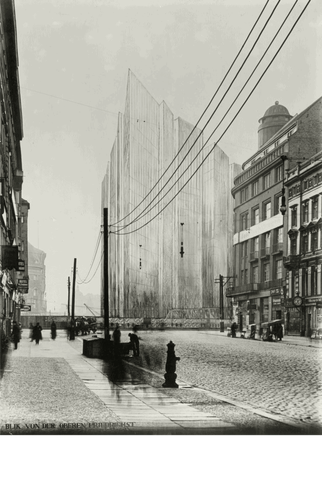


Sudhalter deduces that the commissioned photograph most likely involved ”a large glass negative . . ., a powerful, wide-angle lens, [and] a tripod.”33Ibid., 74. Together, lens, plate, and framing enabled dramatic perspective, telescopic depth of field, and emphasis on the open space of street and sky.
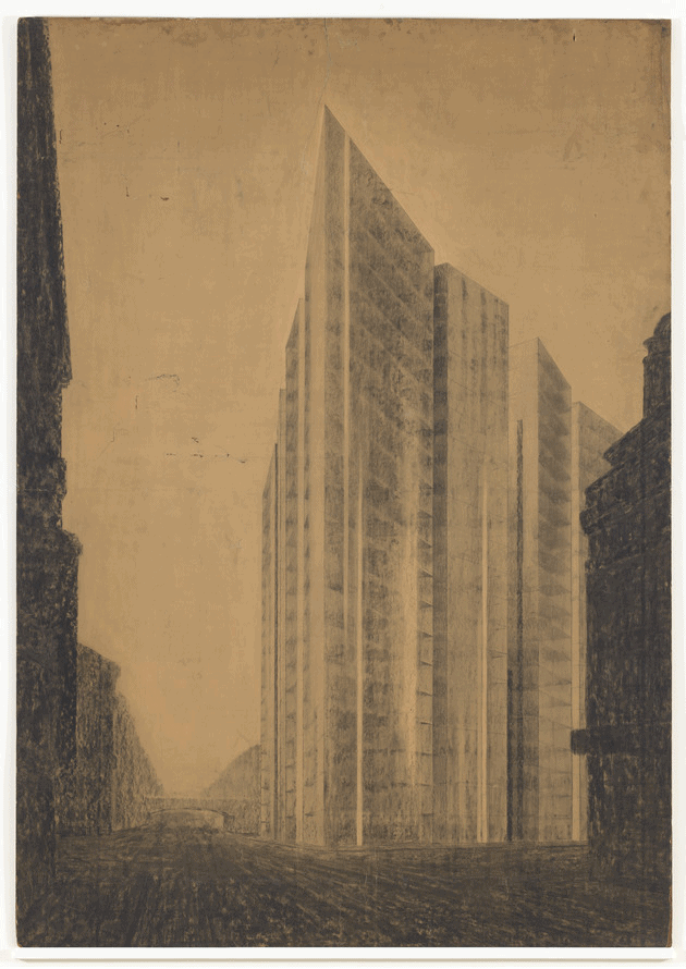
Here’s where process images came in: Mies “seems to have had multiple prints of the image developed in which the sky and building site were blocked out, leaving an area of white emptiness at the composition’s center. These working prints would presumably have had a matte paper surface, conducive to pencil or charcoal, and would have been of a scale comfortable for drawing.”34Ibid., 75.
Which is exactly what happened next: In this first altered version, the skyscraper is drawn in, following the forced perspective of the photograph. The rest of the photograph remains largely unaltered, contrasting the traditional street view with the soaring, hand-drawn tower. In a second altered version, the surrounding traditional buildings are heavily shadowed in “thick crayon,”35Lepik, “Mies and Photomontage,” 325. but with gaps at the right and bottom edges, anticipating subsequent cropping.
The final drawing reproduced in Pásmo was clearly derived from these overdrawn photographs, and the image takes advantage of both media. Here, overhead lines and hanging streetlights have been edited out, traditional buildings have been fully shadowed into framing edges, and the foreground fades in a few clear tonal steps into the deep background, where an enhanced bridge frames the perspective vanishing point. Arguably, these combined visual strategies helped the work to reproduce well.
Which brought us back to the lab. In the Pásmo image, production effects influence how the work communicates. For example, the tower reads as more of a solid volume than the transparent glass of Mies’s fantasy. This is partly the result of the low-quality halftone and paper, as well as the small size of the reproduction. Also, the publishers’ addition of a border (discussed previously in the picture-poem) effectively fences in the dramatic open sky. One wonders if such effects of reproduction influenced the editorial commentary on the work as an example of “resisting the incessant and newly appearing senile neo-classicism.”36“Mies van der Rohe Mrakodrap” (Mies van der Rohe Skyscraper), Pásmo 1, no. 10 (1924): 3.
It’s unknown exactly how the Friedrichstrasse image made its way to Pásmo,37Teige to Černík, October 1924, PNP, AČ Archive; quoted in Forbes, “In the Middle of it All,” 230n466. though its inclusion in Teige’s 1927 štočky inventory strongly suggests that it came through the avant-garde network. To get more of a feel for this type of distribution, I’ll conclude with reproductions circulated through another institution dedicated to spreading new ideas: The Museum of Modern Art.
Soon after its founding in 1929, MoMA recognized the power of disseminating images of modern art, architecture, and design for publication. This is seen most strongly in a collection known as the Architecture and Design Department Photo Files. The files date to the Museum’s early years, and by 1946, the design section alone constituted “nearly 2,000 photographs, mounted and labeled . . . in daily use by students, journalists, and the Museum’s own staff, especially the Circulating Exhibitions Department. The file provides material for the Museum’s design exhibitions and publications.”38Edgar Kaufman Jr., “The Department of Industrial Design,” Bulletin of the Museum of Modern Art14, no. 1 (Autumn 1946): 2–14, https://www.jstor.org/stable/4058147.
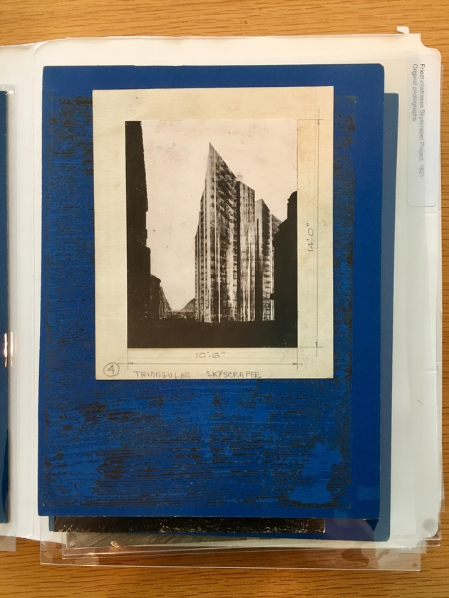
File copies of Friedrichstrasse images evince years of use. One shows crop marks, used to trim and resize analog images for publication. In another, the sky has been clearly lightened in the darkroom, presumably so that the image would print better. A third credits the photographer who made (yet another) copy print. “Please return” stamps are common on these prints and negatives, reflecting their frequent and often (involuntarily) permanent loan. In this way, the image endured long enough to be distributed internationally through the twentieth century.
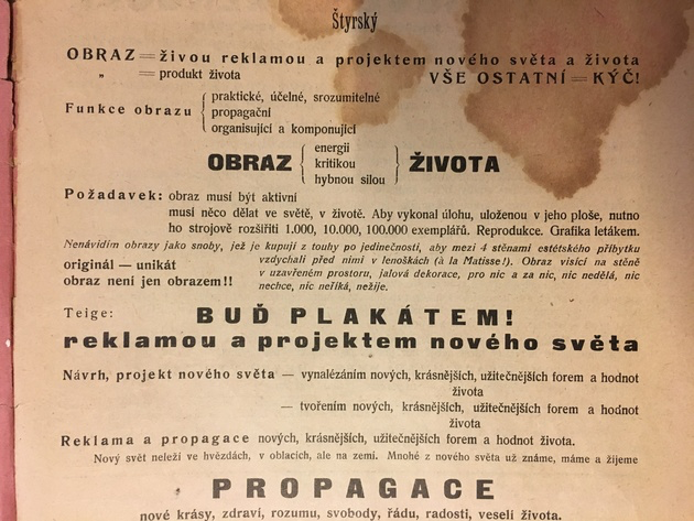
Finishing up in the lab, we turned to the first page of Disk, another Devětsil journal, where a typographic manifesto by Štyrský declares: “A picture must be active. It must do something in the world. In order to accomplish the task . . . it must be mechanically reproduced. 1,000, 10,000, 100,000 copies. . . .”39Štyrský, “Picture” (Obraz), 1; translated in Benson and Forgács, Between Worlds, 364–67. Teige famously went a step further, predicting, “Mechanical reproduction and print will finally make the original superfluous: after all, once we print a manuscript we toss it into the wastepaper basket.”40Karel Teige, “Painting and Poetry,” in ibid., 368. Our investigation of these journals shows that štočky, one step removed from originals, were actively saved and exchanged, and not instantly discarded.
- 1Karel Teige and Jaroslav Seifert, “Umění dnes a zítra,” in Revoluční sborník Devětsil (Prague: Vecernice, 1922), 187–202; quoted in Peter Zusi, “Vanishing Points: Walter Benjamin and Karel Teige on the Liquidations of Aura,” Modern Language Review 108, no. 2 (April 2013): 368–95, https://www.jstor.org/stable/10.5699/modelangrevi.
- 2Peter Brooker and Andrew Thacker, eds., Oxford Critical and Cultural History of Modernist Magazines (Oxford: Oxford University Press, 2009).
- 3Meghan Forbes, “In the Middle of It All: Prague, Brno, and the Avant-Garde Networks of Interwar Europe” (PhD diss., University of Michigan, 2016), https://deepblue.lib.umich.edu/handle/2027.42/1333
- 4Josef Gantner to Karel Teige, 18 November 1930, PNP, KT Archive; quoted in Forbes, “In the Middle of It All,” 232n471; and in Meghan Forbes, “‘To Reach Over the Border’: An International Conversation between the Bauhaus and Devětsil,” in Umění/Art: Journal of the Institute of Art History in Prague 64, nos. 3–4 (December 2016): 292.
- 5Adrian Sudhalter, personal communication with author, March 2019.
- 6Karel Teige, Modern Architecture in Czechoslovakia and Other Writings (Los Angeles: Getty Research Institute, 2001), 15.
- 7Karel Teige to Artuš Černík, October 1924, PNP, AČ Archive; quoted in Forbes, “In the Middle of It All,” 228–29n466.
- 8Vest Pocket Revue, no. 3 (1929–30), unpaginated advertisements between cover and the first page.
- 9ReD 2, no. 1 (1928): 39.
- 10Karel Teige, Film (Praha: Nakl. V. Petra, 1925).
- 11Adrian Sudhalter, ed., Dadaglobe Reconstructed(Zürich: Scheidegger and Spiess, 2016).
- 12Ibid., 93–94.
- 13For an extremely detailed contemporary description of the halftone process and printing block production, see Julius Verfasser, The Half-Tone Process: A Practical Manual of Photo-Engraving in Half-Tone on Zinc and Copper(Bradford: Percy Lund, 1895), https://archive.org/details/halftoneprocessp00verf_0/page/1. A fifth edition was published in 1912.
- 14Reyner Banham, “Sparks from a Plastic Anvil,” in Journal of Modern Craft 1, no. 1 (March 2008): 137–46. This text is a transcription of a lecture given at the Victoria and Albert Museum, London, on April 12, 1973. The quote appears on page 138.
- 15Ibid., 140.
- 16Ibid.
- 17Ibid.
- 18Forbes, “In the Middle of it All,” 233–24.
- 19Ellen Lupton, “Herbert Bayer: Designs for ‘Universal’ Lettering, 1925 and 1927,” in Bauhaus: Workshops for Modernity (New York: MoMA, 2009), 200–205. A metal typeface was never produced, and a digital font was created only in the mid-1990s.
- 20ReD 2, no. 8 (1929): 257.
- 21Kurt Schwitters, “Anregungen zur Erlangung einer Systemschrift,” in i10 1, nos. 8–9 (August/September 1927): 312–16. See also Hannah Pröbsting, “Everyday Printed Matter: Kurt Schwitters’ Experimental Typography,” in International Perspectives on Publishing Platforms: Image, Object, Text, ed. Meghan Forbes (London: Routledge, 2019), 200–23.
- 22Forbes. “In the Middle of it All,” 237n477. Jan Tschichold, Die neue Typographie: ein Handbuch für zeitgemäss Schaffende (Berlin: Verlag des Bildungsverbandes der deutschen Buchdrucker, 1928).
- 23Jindřich Štyrský, “Picture” (Obraz), in Disk, no. 1 (1923): 1; translated in Timothy O. Benson and Éva Forgács, eds., Between Worlds: A Sourcebook of Central European Avant-Gardes, 1910–1930 (Cambridge: MIT, 2002), 364. See also Irina Denischenko, “Photopoetry: Czech Poetism and the Photographic Image,” in Beyond Given Knowledge: Investigation, Quest and Exploration in Modernism and the Avant-Garde, European Avant-Garde and Modernism Studies 5 (Berlin: De Gruyter, 2017), 95–113.
- 24Karel Teige, “Painting and Poetry” (Malířství a poezie), in Disk, no. 1 (1923): 19–20; translated in Benson and Forgács, Between Worlds, 367–69.
- 25Ibid., 368.
- 26See Denischenko.
- 27See Eric Dluhosch and Rostislav Švácha, eds., Karel Teige, 1900–1951: L’Enfant Terrible of the Czech Modernist Avant-Garde (Boston: MIT, 1999); Karel Srp., Karel Teige a typografie: asymetrická harmonie (Prague: Akropolis, 2009); and Rea Michalová, Karel Teige: Captain of the Avant-Garde (Prague: Kant, 2018).
- 28Documented by several works in the MoMA collection.
- 29The most recent example is Adrian Sudhalter, “Friedrichstrasse: The Contexts of an Image, 1922–1924,” in Mies van der Rohe: Montage = Collage (London: Koenig, 2017), 68–85.
- 30Andres Lepik, “Mies and Photomontage, 1910–38,” in Mies in Berlin (New York: MoMA, 2001), 326.
- 31Sudhalter, “Friedrichstrasse,” 74–75 and 74n18.
- 32Ibid., 75n19.
- 33Ibid., 74.
- 34Ibid., 75.
- 35Lepik, “Mies and Photomontage,” 325.
- 36“Mies van der Rohe Mrakodrap” (Mies van der Rohe Skyscraper), Pásmo 1, no. 10 (1924): 3.
- 37Teige to Černík, October 1924, PNP, AČ Archive; quoted in Forbes, “In the Middle of it All,” 230n466.
- 38Edgar Kaufman Jr., “The Department of Industrial Design,” Bulletin of the Museum of Modern Art14, no. 1 (Autumn 1946): 2–14, https://www.jstor.org/stable/4058147.
- 39Štyrský, “Picture” (Obraz), 1; translated in Benson and Forgács, Between Worlds, 364–67.
- 40Karel Teige, “Painting and Poetry,” in ibid., 368.